I’ve said this on a number of occasions with the content that I publish here at ByrneMedia…
One of the biggest problems that ecommerce brands have is the issue with cart abandonment. This all starts with the shopping cart page and the checkout process that follows.
So in today’s post, I want to offer some help to combat this common problem. There are ways in which you can improve the conversion rate of your checkout process so that you acquire more “micro yes’s”, which will lead to more “macro yes’s”… resulting in more sales conversions for your online store.
When your visitors hit that “add to bag/cart” button, they are signaling a desire of purchasing intent. Your offer and brand has persuaded the visitor to begin the checkout process and complete their order.
As a brand, we need to nudge our prospects further down our sales process so that they complete the order with confidence and assurance.
So how do we do that?
How do we encourage as many of these buyer intent visitors as possible to complete their purchase?
Let’s dive into some ways in which we can improve the conversion on our checkout process.
Use a Progress Bar
At the top of your shopping cart, give your shoppers a visual representation of how many steps they need to take in order to complete their purchase. Your visitors want to know what sort of commitment they need to take in order to complete their order.
They want to know it’s going to be easy & quick, with the least amount of friction as possible (don’t have them sign up for your site to complete their purchase).
A progress bar sets the expectation on what it’s going to take to complete their order. The more efficient it is for THEM, the better it is for their experience with you and the conversion rate of your website.
Add Trust Badges and Credibility Logos
These illustrations help to convert your prospects and customers. They are an indication of trust and reliability, which is very important in the psychology of persuasion of your sales funnel.
Make sure you convey to your visitors that your brand and site is a secure, trusted place to do business. From your return policy, to secure payment and how your shipping policy works. You can position these logos close to the payment options and checkout button on your shopping cart.
Allow Guest Checkout
One of the biggest conversion roadblocks with shopping brands online is forcing their visitors to create or login to an account to finish their shopping order. I strongly encourage you not to force your visitors to complete a sign up or login process because this will only add friction to your site.
Doing so will hurt your conversions. Allow visitors to checkout as a guest.
Customers Who Bought This… Also Bought
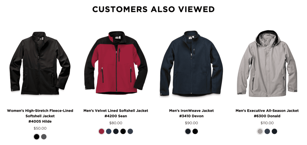
If you’ve shopped with Amazon, I’m sure you’ll notice how they offer related products for the original item you have an interest in purchasing. Your shopping cart page can present up sell or cross sell products that will deliver a more enhanced end result for your customers.
Let’s say you sell dresses on your website. Why not offer a couple of up sells such as shoes, a handbag or even a hat that will match with the dress. This gives your customer a more completed style and a better desired outcome.
Your customer gets more value out of their shopping experience and you as the business owner get the opportunity to increase your average order value.
Show The Final Price Before Checkout
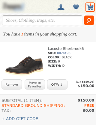
A major reason why your visitor drops off your sales process and doesn’t complete their purchase is down to increased pricing as they move closer toward placing their order.
They move through your shopping cart sequence, filling in all the required details and at the very end of taking all these micro commitments, they notice an increase in price. This turns them off and you lose the sale right there and then.
Now you have to work harder to acquire that sale through retargeting.
Try to optimize your shopping cart so it shows the full price upfront, giving customers confidence that there will be no sudden, negative surprises. This will help to reduce visitor anxiety, friction and deliver an all round better customer experience as they check out.
Include Contact Info For Any Presell Questions
Let customers know how they can reach you by phone and email. Depending on your target audience, a certain segment of your audience may not know how to use your live chat functionality.
Even if for some reason your live chat isn’t staffed when a visitor lands on the shopping cart, having email and phone contact details on the same page can prevent carts from being abandoned due to unanswered questions or any confusion that may be going on in the prospects mind.
Add Product Summary
It’s important to include all details of the item(s) the visitor has added to their shopping cart. It’s not enough to showcase just a name and a product ID. Let the customer know what size, color, and other customization options are available, as this will help them ensure they’ve made the correct choice for their needs.
If possible, you can even include the benefits of each product using green ticks as pointers, just to reinforce the value and transformation the product can deliver to your customer. This will also add confidence and add more persuasion on the sale.
Even if your visitor leaves your shopping cart for whatever reason (pretty common occurrence), when they return to the cart sometime in the future and see the items included in their shopping cart, the summary along with benefits will remind them on why they added the item(s) to their cart in the first place.
Give The Option of “Continue Shopping” From The Checkout Page
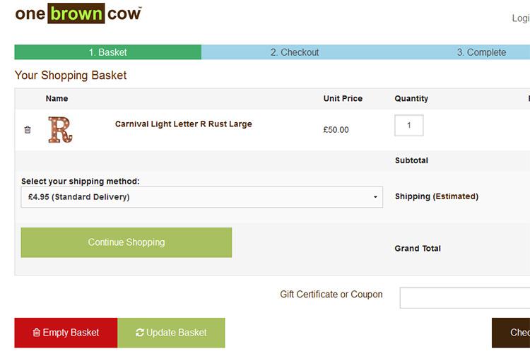
Your visitor may have forgotten something and may wish to return to browsing your site for other items to include in their shopping cart. Perhaps they may want to visit a new category and discover what you have to offer. There’s nothing worse than hitting the back button and finding that all your cart details have vanished.
So give your potential customer the ability to continue shopping on your site, knowing that the items in their cart are going to be there when they arrive back at some point in the not too distant future.
Include Testimonials
If you’ve read my content in the past, you’ll probably notice that I’m a big fan of social proof. Previous customers explaining their positive experiences with how your product transformed a certain situation in their lives and how good it was in doing business with your brand.
Testimonials instill confidence for order completion. So test the idea of having a couple of short text testimonials close to the checkout/express pay options in the shopping cart. This can help to reinforce the desired outcomes your brand has to offer and will persuade more visitors to move further into the checkout process.
Can’t Upsell? Try Downsell
If you can’t convert a customer on your upsell offer, fear not… the order isn’t entirely lost. You can always try a downsell offer. Downselling is a more budget-friendly option to offer your customers after they rejected the upsell.
If your prospect declines the up sell which is designed to enhance the end result of their needs & desires, then try a downsell which is more budget friendly. You may see a lift in conversions using the downsell approach. This lets you make money on an order regardless if it isn’t quite as much as you’d hoped with the up sell.
Include a Gift Wrapping Option
This idea is a great thing to include when you have seasonal shopping events popup throughout the year. Including a gift wrapping option depends on what you sell. Gift wrapping and personal message creation help to add that “personal touch”, while helping your customers save time. It’s an added upsell you can do to help increase the order cart value.
Offer Free Shipping When The Customer Spends a Certain Value Amount
One of the most persuasive influences that help your customers make a purchasing decision with your brand, is offering free shipping on their order. Brands can’t realistically afford to offer free shipping on every order as it cuts into their bottom line.
So to combat this, why not offer free shipping on orders that hit a certain order value? You can set a dollar/pound/euro amount needed to reach the free shipping threshold. For example, you can offer free shipping on orders of $75+ on your store. This will help to increase your average order value and give you room to fit free shipping into your cost of goods sold.
Many savvy shoppers will include additional items to their shopping cart to receive something for free, especially delivery. You can also incentivise your visitors by offering free shipping if they include a 2 for 1 deal, or make a purchase on a specific time frame. This time specific free shipping model is ideal for increasing sales during slow periods, or offers further incentive during highly-competitive seasons.
Give Approximate Shipping/Arrival Date
Customers love to know when their order is going to arrive. It’s part of the excitement when shopping online. Being able to offer an approximate shipping/arrival date via a post/zip code can really help to enhance the customer journey and deliver more satisfaction to the experience of shopping with your brand.
So if possible, try to include this option as part of your conversion rate optimization on your checkout process.
Provide Multiple Payment Methods
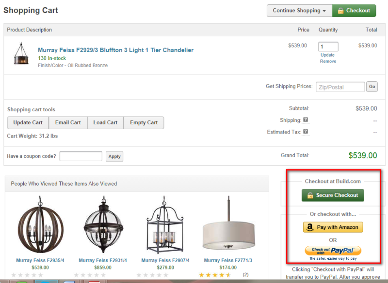
Another option of smoothing out your customer experience is to offer your customers multiple payment methods in your checkout process. Not everyone that wants to make a purchase with you, wishes to do so to by inputting their credit card info as well as shipping details. You’ll likely convert more online shoppers by using online payment services like Paypal or Google Pay. Its best practice to offer both the traditional payment route as well as the more express checkout payment method.
Include The Latest Promo Codes On Your Shopping Cart
There’s nothing worse than going off-site to a coupon directory to find a code and then returning to the site in question to use it. Keep those shoppers on your site longer by including the promo code right on the shopping cart page. They can enter the code, view the reduction in price, which will motivate them in completing their purchase with your brand.
Show Contrast Pricing With Discounts & How Much Can Be Saved
Who doesn’t like knowing about a good deal? Everyone loves a good deal! If you can convey to your visitors the previous price of an item and the discounted price, you’ll encourage your visitors to complete the order while it’s still on sale.
You can also mention how much money your visitor can save on the deal. Using highlighted copy in a bold font such as “You save $24” will help build a visual representation on the value of the deal and offer more motivation to purchase.
Offer Financing Options For Higher-ticket Items
If you sell products that cost several hundred, if not thousands of dollars/euros/pounds to purchase, you might want to consider the idea of giving a financing option to your shoppers. Giving the option to pay for a high ticket product in installments will help to improve your sales conversion rate.
A financing option benefits you the merchant to shift those higher ticket products such as electronics, mattresses, furniture, jewellry, high end cosmetics & apparel etc.
Conclusion
That completes the list on how to improve conversion rates on your checkout process. If you’re experiencing a problem with conversion rate on your checkout funnel, try testing some of the suggestions I have mentioned above.
Providing more value during that checkout process will encourage more of your visitors to complete their order. From showing testimonials, upfront costs, free shipping, multiple payment options etc. All these elements mentioned in this post will improve the conversion rate of your checkout process and drive more sales for your brand.
