Product pages are important parts of your sales process and customer journey. The reason for this is because any visitor who’s viewing your product pages is most likely in the behaviour of buyer intent towards the solution that you have to offer.
So considering that mindset on product pages, it’s important that we take that visitor from curious about our solution, to persuading them to purchase our solution.
So how do we make a good job of persuading our visitors to take that all important micro commitment and hit that “Add to cart” button. Not just persuading them, but giving them the confidence to know that you as a brand are doing your best to fulfil their needs during this process and after the transaction takes place.
We have to make sure that our product pages are doing the following –
- Increasing the value we have to offer
- Decreasing the risk and buyer anxiety they might be experiencing at this point in the sales journey
How do we go about increasing persuasion with our target audience so that they buy our solutions?
Let’s solve this in this post/presentation
Use High Quality Images/Video
The first impression you can make and the most eye-catching is the use of good quality images and/or video. Images and video are your opportunity to show your products in their best light. The more engaging they are the better as your potential buyer will indulge themselves further into your product and the value it’s trying to deliver on.
When selling on the web, we can’t just pick up the item, feel it, turn it 360 and examine the finer details of the product. So we have to create as best an experience as possible for our potential buyers by showing multiple high quality images of the product, with a zoom feature and even a product demonstration that shows how this product can produce positive desired outcomes for its target audience.
Without including high quality images and/or video, uncertainty about product quality may become a conversion blocker with your potential buyers.
Use Persuasive Product Descriptions
After good images and video, comes product descriptions that are designed to support the value proposition of the product. Here you can talk about the problems, pain points and desired outcomes your product will deliver on. Explain the benefits, use storytelling if you can (helps to engage your audience on a deeper level). Make it easy to read & scan, especially on mobile devices.
Don’t just copy and paste the manufacturer provided description (which also hurts SEO).
You want to write copy that’s going to engage, influence and persuade your audience that what you have to offer is going to produce those “feelings” they long for when it comes to that pain point they are experiencing, or that pleasure point they desire. Address the positive outcomes and you’ll see an increase in your visitors hitting the ad to cart button.
Use Genuine Scarcity
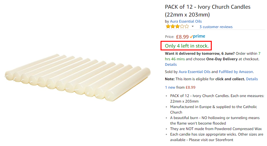
If at all possible, use scarcity on your product pages to show that you only have X amount of the product in stock. Scarcity tends to drive conversions due the FOMO effect. The “Fear Of Missing Out” effect works.
If your product is doing a great job of fulfilling a need and desire from your target audience and at the same time, you only have a limited quantity of the product, this will increase the motivation of your visitors to make the purchase now as they won’t want to miss out on this opportunity.
Convey How Other Visitors Are Behaving
There are some good software plugins on the market these days that allow you to build social proof based on your visitor behaviours. What I mean by this is that these plugins give your visitors an understanding of the type of behaviour that other visitors are experiencing on your website.
For example –
If your visitor is on a product page, you can have a pop up that shows how many are viewing this product right now. Or how many have purchased this particular product in the last 24 – 48 hours. You probably have noticed this social proof on travel websites, but it’s also becoming more popular with ecommerce brands.
These behaviour triggers work two fold. It leverages the power of popularity as well as triggering the fear of missing out (FOMO) on what others have. These factors help to increase conversions.
Highlight Any Price Changes
If you’re offering a discount on an item, be sure to highlight what the previous price was. Show the percentage and amount of money they’re saving. Any sort of deal or discount should be conveyed in this way as it stacks more value that the customer will receive by taking action on purchasing the product.
If the price is set to go up again, definitely let customers know when this is happening and how much it’s going up by.
The threat of paying more tomorrow, creates urgency to buy now.
Show When The Product Will Be Delivered

Your customers love to know when they can expect their product to be delivered. It’s part of the excitement of receiving their item and improves the customer experience with your brand.
So if possible, try to show your visitors the time they can expect to have their order fulfilled and delivered to their door. Building these expectations and shifting their mindset to acquiring the product will help to boost your conversions and have your visitors hit that all important add to cart button.
Offer Live Chat
If you have the resources to do so, you should at least test the idea of offering live chat.
Offering live chat. This can be a fast & effective way to communicate with customers as they are browsing your online store. Striking up a helpful dialogue can improve sales conversion rate on your site.
Not only can it help to boost sales conversions, but live chat can also help to increase average order values by cross selling and upselling other products on your store. This can result in an even better desired outcome for your customers.
The more engagement and human connection there is with your online shopping experience the better. Whilst your brand may offer fantastic value, the addition of a live chat can really help to offer that human bond we receive when shopping instore.
Live chat is also great for immediately solving sales objections with potential buyers, advising on how your customers can receive better value and as mentioned before, a better all round user experience with your brand. It can even improve cart abandonment, which is a real issue with ecommerce.
Some of the chat software that you might want to consider are applications like – LiveChat, ProProfs or Freshchat.
Try Bundling & Cross Selling
Can you offer a bundle that will add more value for your customers?
Think about bundling items together to create a more enhanced desired outcome for your customers.
An example of this would be –
Your page focuses on selling a dress shirt for men. What about bundling things like cufflinks, a tie, a dress jacket or some other accessory that will deliver a better end result for the customer. Can you stack more value with your products?
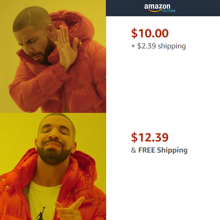
You can even offer a discount when you bundle products together. This can create an offer that is irresistible to refuse. The value of the bundle may pass your threshold for free shipping, so now you’ve stacked more value in the process.
As you can see, there is a lot of benefit to be had when you bundle some of your products together. Your average order value increases and so can your sales conversion rate with all the value you stack in the offer.
This can work out to be a real Win – Win situation for you the store owner and your customers.
Use Retargeting To Funnel Browsers Into Buyers
You work hard to attract your target market to your website and even product pages for that matter. Visitors that take a look at your actual product pages have more intent with purchase consideration.
So the last thing you want to happen is have them take a look at your product, only for them to bounce back to the original page they came from and not purchase. There are various reasons why a visitor would bounce.
A couple of reasons why visitors bounce from your product page is because –
- They wanted more time to consider the offer
- Their attention was focused on another distraction around them. (Kids, phone rang, notifications from whatsapp/instagram etc popped up)
In order to capture their attention, you want to pixel them using the likes of Facebook or Google’s pixel. This will allow you to retarget these event based behaviour’s from this specific segment of your audience and use ads and offers that resonate with them and motivate them to return back to the product they were viewing in the first place.
Highlight Your Return Policy
This can be done through a logo located underneath your add to cart button and then explaining your return policy in finer detail on your product page. All the points I mentioned previously are all about developing value for your visitors. The goal is to stack lots of value which in turn influences your visitors to click the add to cart button and purchase.
A good return policy is designed to mitigate any risk and explain to your visitors that if they are not happy with all this value you’re offering, they have the opportunity to return the value offered and acquire their money back.
So stack value and reduce risk with a good return policy. Ikea and Zappos have amazing return policies. If you don’t like what you bought, they allow you to return the product within 365 days.
Now that’s mitigating risk!
If Possible… Show Reviews

I mention this in previous posts and videos. Try to show as much social proof as possible with your products. This might not always be possible for your brand, but where possible you should definitely be showcasing a healthy amount of social proof and testimonials from your previous customers.
This type of content isn’t exclusive to your product pages. You can also exhibit this content on your homepage, cart page and even your about page.
Whatever the item is that you are trying to sell, it’s designed to deliver an outcome for your target market. It was created to take away pain points and/or deliver pleasure points. Its designed to create a feeling the customer is seeking.
So…
If I am the target customer of your product and I read and view other people in “my tribe“ who are receiving positive results and transformations from dealing with you as a brand, then I am much more likely to convert into a customer.
Positive customer reviews tell good stories, A – B transformations, desired outcomes, happy endings etc. This can only help to influence and persuade your visitors to make a purchasing decision and help to reduce feelings of buyer remorse.
